News
2023-05-24 08:12:00.0We evolve our brand logo and maintain the values of sustainability and innovation
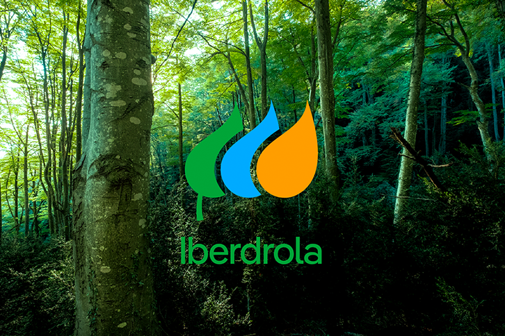
- It has opted for a simpler visual language, with solid colours that improve its visualisation in digital media.
- The new logo is 50% lighter than the previous one, which reduces energy consumption and speeds up the download speed on websites and apps.
- It uses a more modern typeface with lowercase letters that convey greater closeness.
- The colour palette maintains Iberdrola's commitment to the planet: renewable energy, through green; water and wind with blue; and the sun, through orange.
This morning, Iberdrola presented an evolution of its brand identity designed to tangibly reflect the reality of a sustainable, innovative company, a world leader in renewable energy, which evolves with society's needs.
This is an evolution based on its current, highly recognisable icon, which will act as a link between all the countries in which the company operates and which will be implemented in an initial digital phase to be gradually adapted to physical formats.
The evolution of the identity responds to the need to adapt to an increasingly digital world. Although it aims to maintain the origin, essence and values of the brand - with a logo that is well known among customers and the general public in our country - it will allow a simpler application for all formats and supports.
A more sustainable brand
The evolution of this identity is designed to create a more sustainable, digital, approachable and modern brand. The commitment to sustainability is one of Iberdrola's hallmarks and has been part of its origin since it was created more than 170 years ago, anticipating society's energy needs and transforming itself to find solutions that preserve the environment for future generations.
The change in its identity reinforces Iberdrola's ambition to continue to position itself as a brand that remains a pioneer in its unwavering commitment to the decarbonisation of society and the well-being of all people.
With this evolution, the brand demonstrates the company's sustainable DNA and more accurately represents what Iberdrola is: a key player in the electrification of the economy, which seeks to inspire society in the need to care for and give back to the planet what it has given us. And a brand that is always moving forward and going one step further, pursuing increasingly ambitious goals, such as achieving zero emissions by 2030, thus supporting one of the most important SDG.
The new version of the logo evolves its previous version to make it easier to apply, generating greater contrast and better visualisation in digital media, resulting in a simpler, more usable and accessible visual language.
More modern, in lower case, the logo improves legibility and brings the brand closer. In addition, due to its simplicity, the new logo is 50% lighter, which guarantees lower energy consumption, a faster download speed and, consequently, energy, cost and time savings.
The rest of the resources have also been conceptualised to improve the application of the brand and contribute to reducing the carbon footprint, implying lower energy consumption and encouraging more simplified design use and application regulations that help in its implementation, from eco-design, to the choice of materials, waste reduction, energy saving or local production.
The colour palette chosen represents Iberdrola's vision of the world and its commitment to the planet, favouring the association of the brand with three key elements of its value proposal: renewable energy, through green; water, with the colour blue; and the sun, through orange. Also relevant is the new typeface family chosen, IberPangea, which is variable, more efficient and legible, designed to work effectively both in the digital and offline world.
All of this makes for a more contemporary visual identity, which unequivocally underlines and conveys the spirit of optimism and innovation that characterises the company, but which also maintains the essence of what Iberdrola has always been.
The evolution of the brand will be carried out in a sustainable manner and the logo will be replaced based on economic and sustainability criteria, as the brands are designed to be able to coexist in time and space for as long as necessary.


